To chart monthly spending by category, you need one thing first: every expense tagged with a category. After that, a pivot table or one SUMIFS formula per category gives the totals, and a sorted bar chart shows them. The tagging is the slow part; the chart takes under a minute.
What does the data need to look like?
One row per expense, with these columns: Date, Description, Category, Amount. Keep one spelling per category, because Fuel and fuel and Petrol will be counted as three different things. A drop-down list in the Category column stops spelling drift.
A worked example with made-up numbers
Say a delivery rider's month looks like this:
| Category | Amount in rupees | Share of total |
|---|---|---|
| Fuel | 6,200 | 24.8 per cent |
| Food | 7,400 | 29.6 per cent |
| Phone and data | 1,100 | 4.4 per cent |
| Vehicle repair | 2,300 | 9.2 per cent |
| Rent share | 6,000 | 24 per cent |
| Other | 2,000 | 8 per cent |
| Total | 25,000 | 100 per cent |
Adding up: 6,200 plus 7,400 is 13,600; plus 1,100 is 14,700; plus 2,300 is 17,000; plus 6,000 is 23,000; plus 2,000 is 25,000. Each share is the category divided by 25,000, so fuel is 6,200 divided by 25,000, which is 24.8 per cent.
How do you total by category?
With a formula
- In Excel 365 or Google Sheets, list the categories with =UNIQUE(C2:C500) in a blank column.
- Beside each category, total it with =SUMIFS($D$2:$D$500,$C$2:$C$500,F2) where F2 holds the category name.
- Fill down, then add a total with =SUM(G2:G7) to check against the sum of all amounts.
With a pivot table
Select the data, insert a pivot table, put Category in Rows and Amount in Values as a sum. Refresh it when you add new rows.
Which chart should you pick?
- A horizontal bar chart, sorted largest to smallest, reads best when you have more than four or five categories.
- A pie or doughnut chart is fine for three or four categories, and gets hard to read after that.
- A column chart with months on the bottom and one colour per category shows trends across several months.
- Label the bars with rupee amounts, not just gridlines.
What should you look for on the chart?
Look for the one or two bars that are larger than you expected, and for any category called Other that is bigger than a few of the named ones. A big Other means you need more categories. In the example, fuel and food together are 13,600 of 25,000, so over half of spending sits in two bars. For a gig worker, fuel is also linked to how many hours you work, so a rise may mean more income, not worse habits; compare with earnings.
How do you compare this month with last month?
Put the two months side by side in one table with a third column for the change. If fuel was ₹6,200 this month and ₹5,400 last month, the change is 6,200 minus 5,400, which is ₹800 more. A clustered column chart with two bars per category makes the same point visually. Keep the category order identical in both months so your eye does not have to hunt, and show the largest changes first rather than the largest totals.
How can an app do the first step?
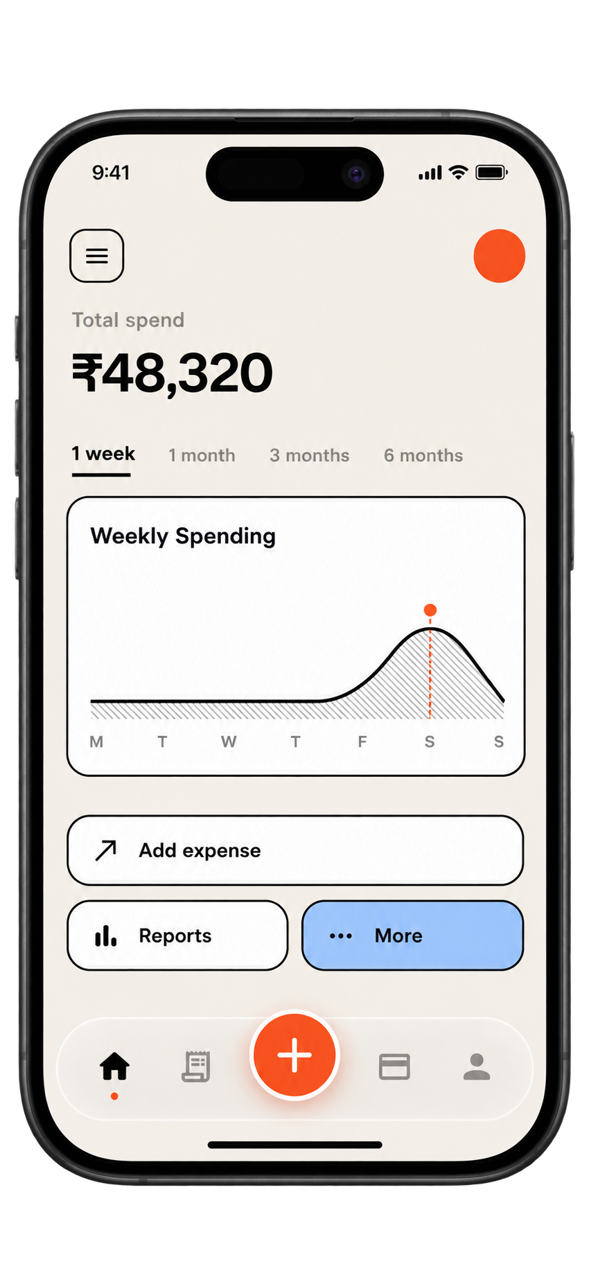
If you import statements into SpendixAI, categorisation is done in stages: your own rules, then your history and similar merchants, then optionally an AI model for what is left. You can turn the AI step off. The dashboard and insights show spending for the period compared with the previous period, and the reports section has a library of 25 reports plus a Report builder. You still need to review the categories it assigns, particularly for cash.
A five minute routine
- Import or paste the month's expenses.
- Fix any wrong categories.
- Refresh the totals.
- Check the grand total against your bank statement.
- Save the chart as an image for next month's comparison.
Useful ideas start with a clearer picture of your own spending.
Explore your reports