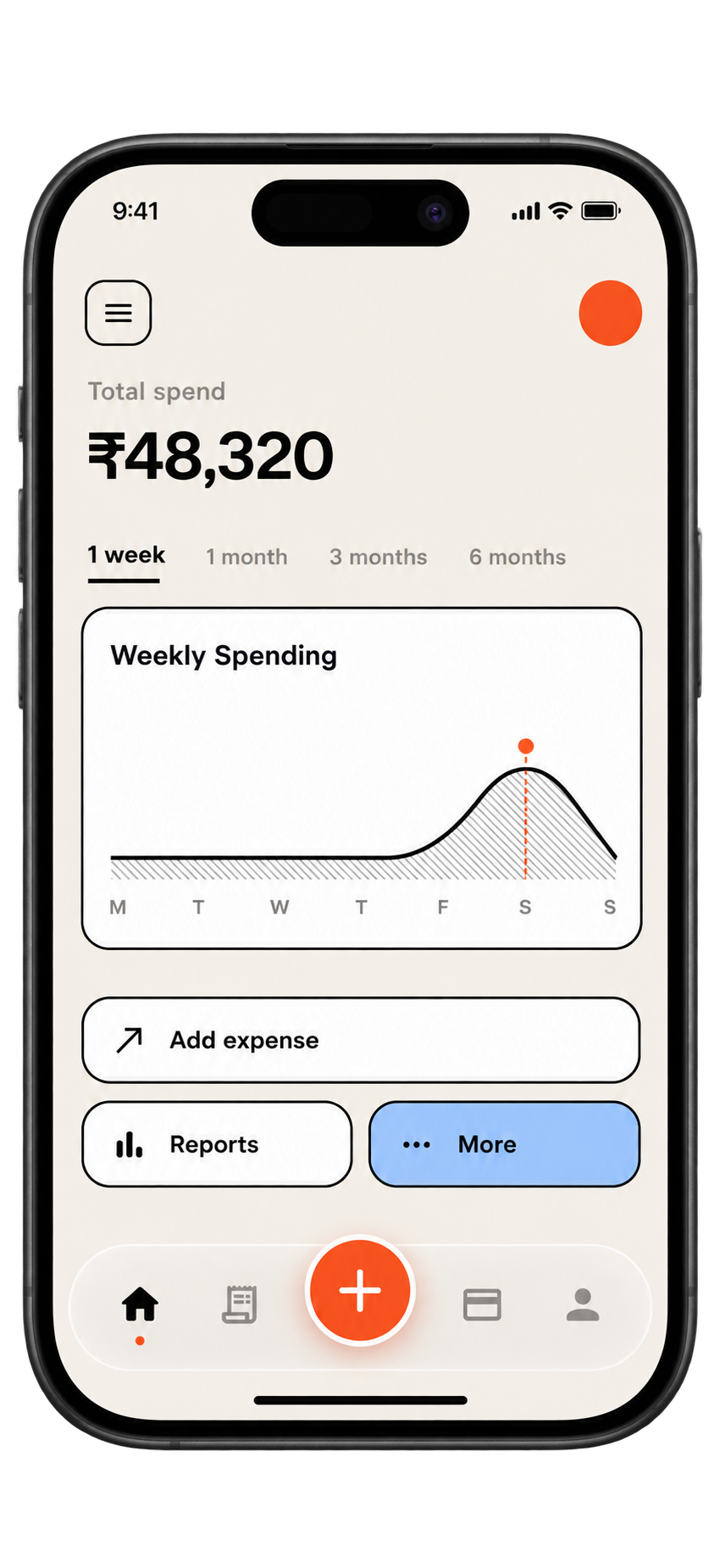
A single dashboard for your accounts and cards earns its keep if it shows four things: every account in one place, what you owe on each card, the date each figure was last updated, and how the net total changed since last month. If any of those is missing, you are looking at a snapshot, not a dashboard.
What should you expect it to show?
- Every account and card on one screen, including the ones you rarely use.
- Amounts owed shown as debts, not mixed in with your savings.
- A last updated date on each figure, so you know how fresh it is.
- A trend line or a month-on-month change, not only today's total.
- A way to see recent activity in any single account.
This list works whether you build the dashboard in a sheet or evaluate a tool someone else has made.
What should you check before trusting it?
- Add up the accounts yourself once and compare with the total shown.
- Check that card balances are subtracted and not added.
- Check that a transfer between your own accounts is counted once, not twice.
- Check what happens to a pending payment.
- Ask how it gets its data: manual entry, an uploaded statement, or a connection. If it is a connection, ask what login details it needs.
Be wary of anything that asks for your online banking password. Statement uploads and manual entry avoid that problem.
A worked example with made-up numbers
Say you record month-end figures for an everyday account, a savings account, one credit card and a buy-now-pay-later balance.
| Month end | Everyday | Savings | Card owed | BNPL owed | Net |
|---|---|---|---|---|---|
| January | A$2,800 | A$9,000 | A$1,100 | A$300 | A$10,400 |
| February | A$3,100 | A$9,500 | A$900 | A$250 | A$11,450 |
| March | A$2,200 | A$9,500 | A$1,600 | A$400 | A$9,700 |
The January Net is 2,800 plus 9,000 minus 1,100 minus 300, which is A$10,400. February is 3,100 plus 9,500 minus 900 minus 250, or A$11,450, a rise of A$1,050. March is 2,200 plus 9,500 minus 1,600 minus 400, or A$9,700, a fall of A$1,750. The trend line is the story: the fall came from the everyday account dropping A$900 and the card owed rising A$700, not from savings.
How does the trend help you decide?
Seeing that March fell because of the card, not the savings, tells you where to look: what was bought, and was it planned? That is a smaller job than staring at one total and wondering. Write a one-line reason beside each month so that in a year you can look back and tell why a figure moved.
What if the dashboard and your statement disagree?
Trust the statement from your own bank, and find the reason for the gap. The usual causes are a pending payment, a transfer in transit, or a figure that was entered a few days ago and has since moved. Write the reason in a note and correct the dashboard. If you cannot find the reason after a few minutes, leave a flag on the row and look again after the next statement.
Where does SpendixAI come in?
SpendixAI is built around India and INR and is not offered in Australia. The thing worth borrowing from it is the idea of an accounts view that lists every account with its activity. Imported transactions keep the account they came from, so you can look at one account's history by date. A sheet can do this too: one tab of transactions with an Account column, and a filter.
Your next hour
- List every account and card, even dormant ones.
- Fill in last month's figures and this month's.
- Calculate the change and write one reason.
- Decide whether you will update by hand or look for a tool, using the checks above.
Useful ideas start with a clearer picture of your own spending.
Explore your reports